Melisa Merlin
Digital Photography 1
Photographing the Principles of Design

Balance
Shutter speed: 1/250
Aperture: F11
ISO: 6400
Capture from: Eyelevel
Edited with: Lightroom

Focal Point
Shutter speed: 1/100
Aperture: F11
ISO: 6400
Capture from: Birds Eye
Edited with: Lightroom
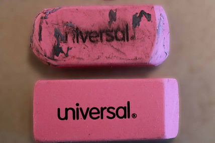
Contrast
Shutter speed: 1/100
Aperture: F11
ISO: 6400
Capture from: Birds Eye
Edited with: Photoshop/ Lightroom

Pattern
Shutter speed: 1/100
Aperture: F11
ISO: 6400
Capture from: Eyelevel
Edited with: Lightroom
Framing
Shutter speed: 1/250
Aperture: F11
ISO: 3200
Capture from: Eye Level
Edited with: Lightroom

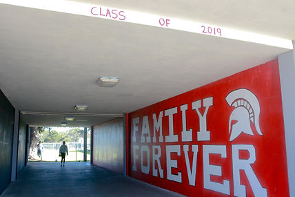
Leading Lines
Shutter speed: 1/200
Aperture: F11
ISO: 400
Capture from: Eye Level
Edited with: Lightroom

Rule of Thirds
Shutter speed: 1/100
Aperture: F11
ISO: 100
Capture from: Low Angle
Edited with: Lightroom
Glews
1. The two photographs that I will be talking about are Focal Point and Contrast. For Focal Point I photographed some colored pencils arranged neatly next to each other and I made one of the colored pencils be laying more above the rest, since all the colored pencils were aligned right next to each other I needed one to be different from the other so I put it laid more above. It shows Focal Point because one of the colored pencils is standing out and that pencil would catch my eye if it was my first time looking at the image. For contrast I took a photo of two erasers but I had an unused one and above it I had a used one which was dirty from the lead of pencils. That shows contrast because one is used and the other is unused which makes them opposites of each other because clean and dirty are opposites. I had the erasers laid one above the other to show the difference in them. For both of the photographs I used a high angle to capture the objects from above. I believe that the principle of design I was most successful with was Rule of Thirds. I believe I was most successful with that principle because when I took the picture on my camera the subject that I was photographing was right on the lines, and also the whole picture was in focus.
2. The photograph I'm choosing from my project is the one that I used for leading lines. For this photograph I wanted the viewer's eye to first go to the word on the wall that says Spartan. I used leading lines for this because the stairs create lines that lead to the word on the wall. But I also used Focal Point since the stairs are a plain color and the wall next to it is a red color which to me stands out. I chose this angle because I tried making it seem like the lines were sort of pointing to the wall. Also the perspective that I used was eye level, and I used that perspective because I needed to get the wall and stairs together so that was the perfect perspective for me. A challenge I faced was getting good lighting because the wall had shadow but the stairs had light and to me that looked a little off so I tried to get good lighting for both.
3. For contrast I edited it on lightroom and photoshop. I first took the picture in focus and uploaded it to lightroom . I made the shadows darker so that the pencil led on the used eraser would stand out more. After I did that I then went on photoshop and I blurred out the background so that the main focus would be the objects which are the erasers. Blurring out the background made the photo better because the viewer would pay attention to the subject and see the contrasts and not pay attention to the background. One editing skill I improved on was making the colors of the objects or background stand out more for example making the colors more vibrant. A photography skill that I improved on was capturing my photos straight and not slanted.
Before Editing

After Editing
